
Effective signage is both an art and a science. You would be surprised to know how much preparation and research is invested to make something common as business signage. The truth is, signage is very important for a business, especially if it becomes the backbone of their promotional campaign. That is actually the case for the local small and medium scale businesses.
This is why signage has become an industry in itself. There are companies that provide wide format printing services and other solutions. They can also help create your logo, as well as the design and layout of your actual signs. As it is already an important industry, experts have conducted studies on these, like the use of color for effective signage.
Here are some of their recommendations:
Be Particular in Choosing the Foreground and Background Colors
When you choose a background for your design, avoid using any part of the design that will take away the focus on the main message. The spotlight should be on the logo and the business name, and any addition and insertion should be complementary to that sign.
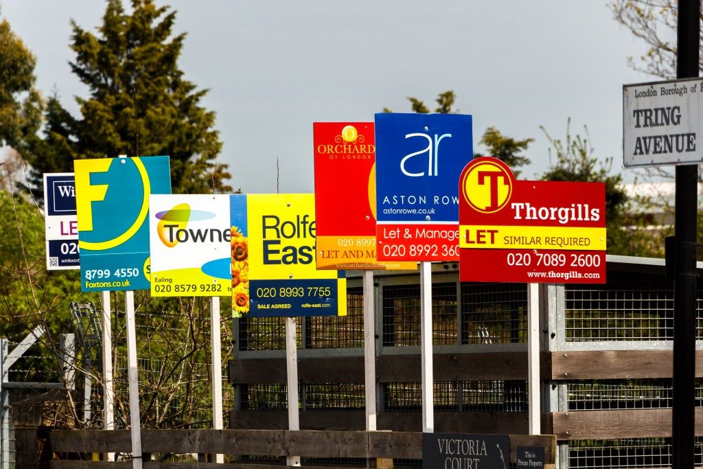
Learn About Contrasts and Let Them Work for You
We have an idea about the basics of contrasts. We know that black contrasts well a light colored background; conversely, white would be a good contrast for colors having a dark value.
Your company would probably have official colors and for your design, you can choose to prioritize which colors would be used for the background and the font.
What you should consider is that the greater the contrast, the more legible the text appears from a distance. If you use colors that are close in shade, for example, a light green letter against a powder blue background, that will not contrast very well and it will be difficult for people to read them from ground level or from a distance.
Choose the Most Legible Color Combination
To illustrate how important this is, the Outdoor Advertising Association of America (OAAA) studied different color combinations in order to test their visibility, and they came up with astonishing results. They have shared the results in the following order: The #1 color combination is the most legible and #15 is the least legible.
1. Black on a yellow background
2. Black on a white background
3. Yellow on a black background
4. White on a blue background
5. Green on a white background
6. Blue on a yellow background
7. White on a green background
8. White on a brown background
9. Brown on a yellow background
10. Brown on a white background
11. Yellow on a brown background
12. Red on a white background
13. Yellow on a red background
14. Red on a yellow background
15. White on a red background
If you notice, there are companies who have used this knowledge to their advantage. One example would be Western Union who uses the black and yellow background. Their signage is conveniently located, which helps their customers find their branches and affiliates easily. Even smaller signs are visible just because of the higher contrast. While it is not good advice for all companies to use the black and yellow, the list could be a guide for the actual design.
The use of colors and the different combinations can help make your signs get the attention of your target customers, which is the purpose of the signage, to begin with.